welcome to my portfolio
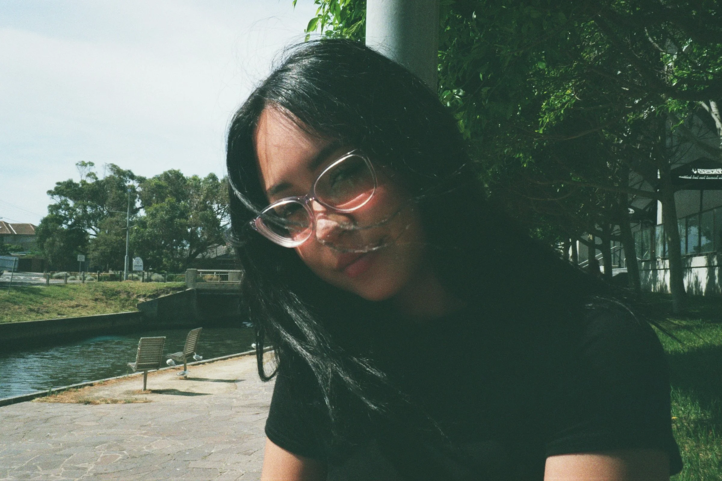
Hi there!
My name is Eloise, I am 25 years old.
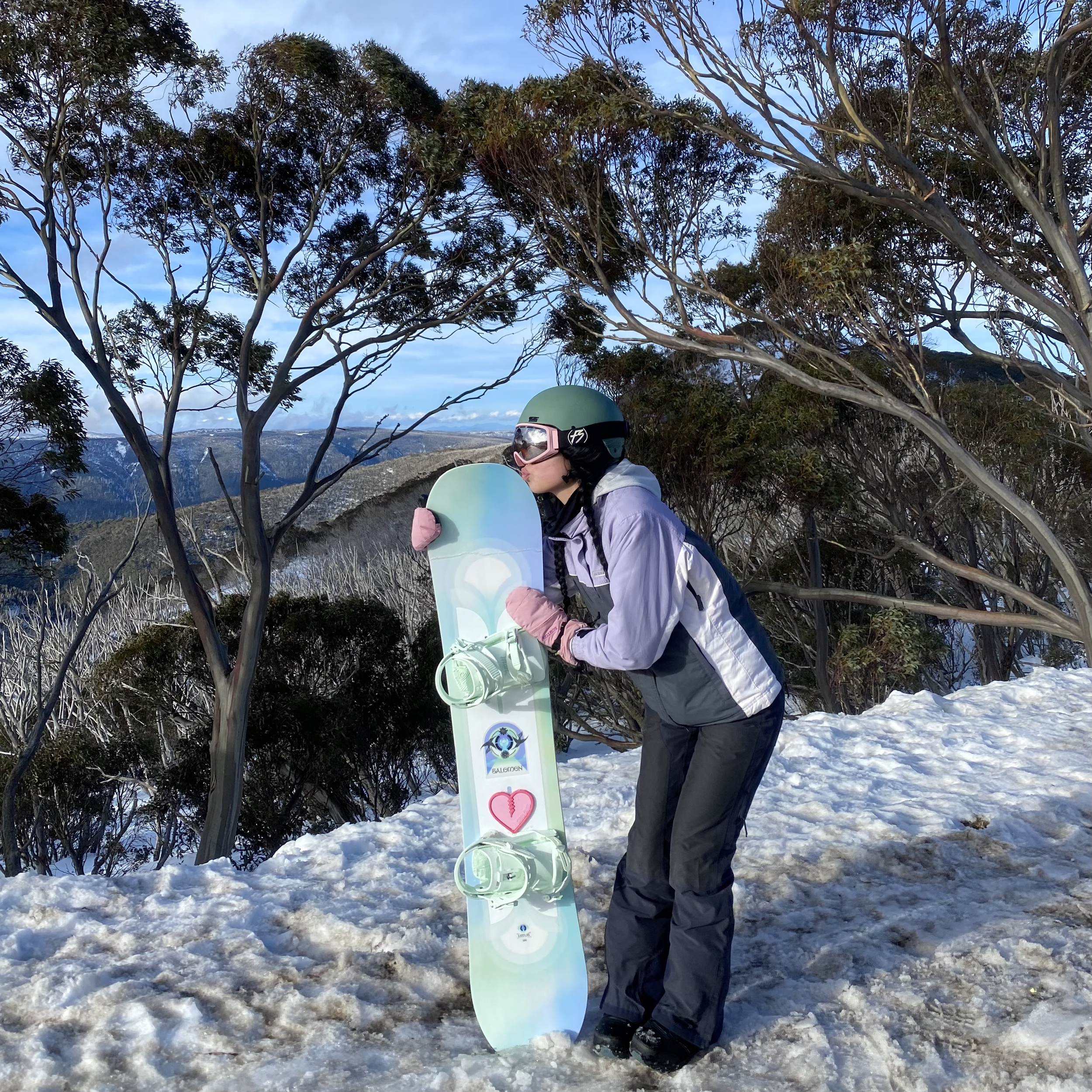
I’ve lived in Melbourne my whole life, I am a south-east gal to the core. I crave sunshine, bask in it at the beach as much as possible. Snowboarding during winter is my favourite hobby but dancing with my friends owns my heart.
I have a Bachelor of Design (Communication Design) from RMIT. I know to how to critically analyse briefs and create design that is meaningful and impactful - please help me make more!


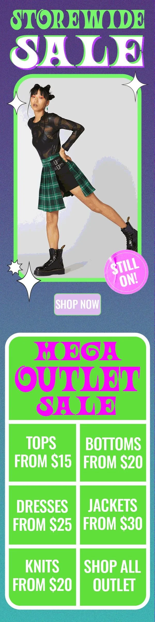
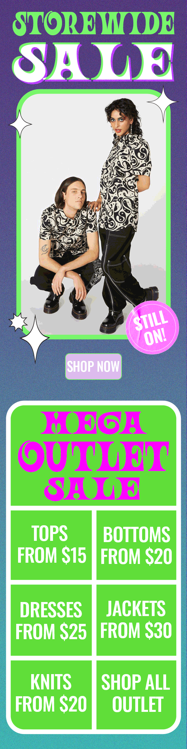
marketing
Marketing material made for Factory X, parent company of Gorman, Dangerfield, Princess Highway and more. During this internship I worked on all three of these brands, making graphic design to be shown in-store, on websites, edms and Instagram, following each brand’s own style. During this internship I made banners for websites, Instagram stories, tiles and videos, I created electronic direct mail marketing sent to emails and promotional posters printed for stores.


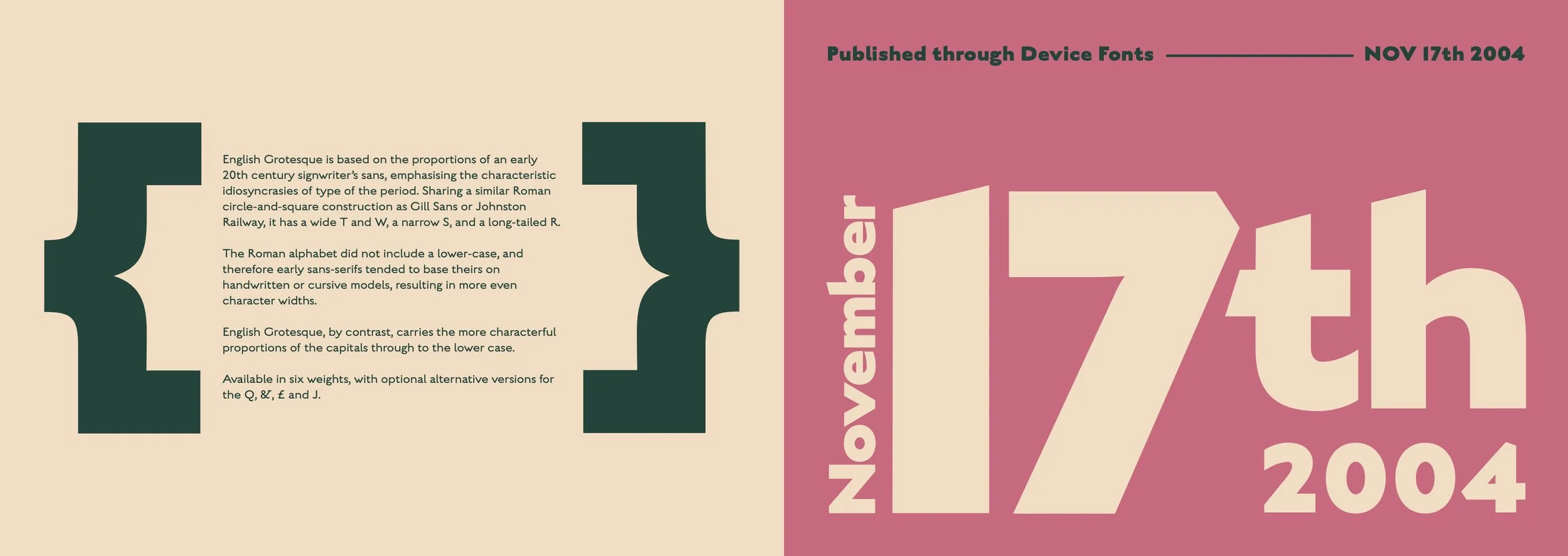
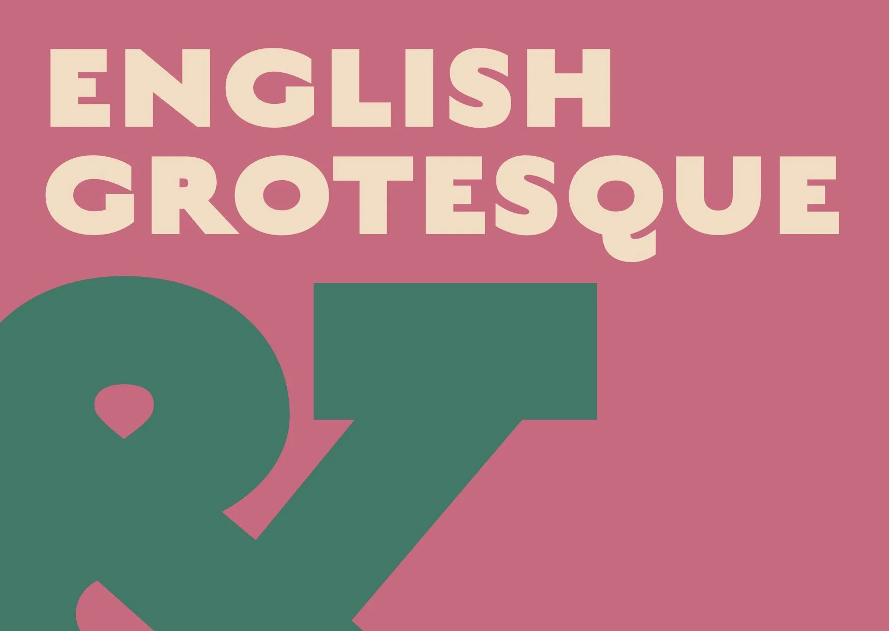
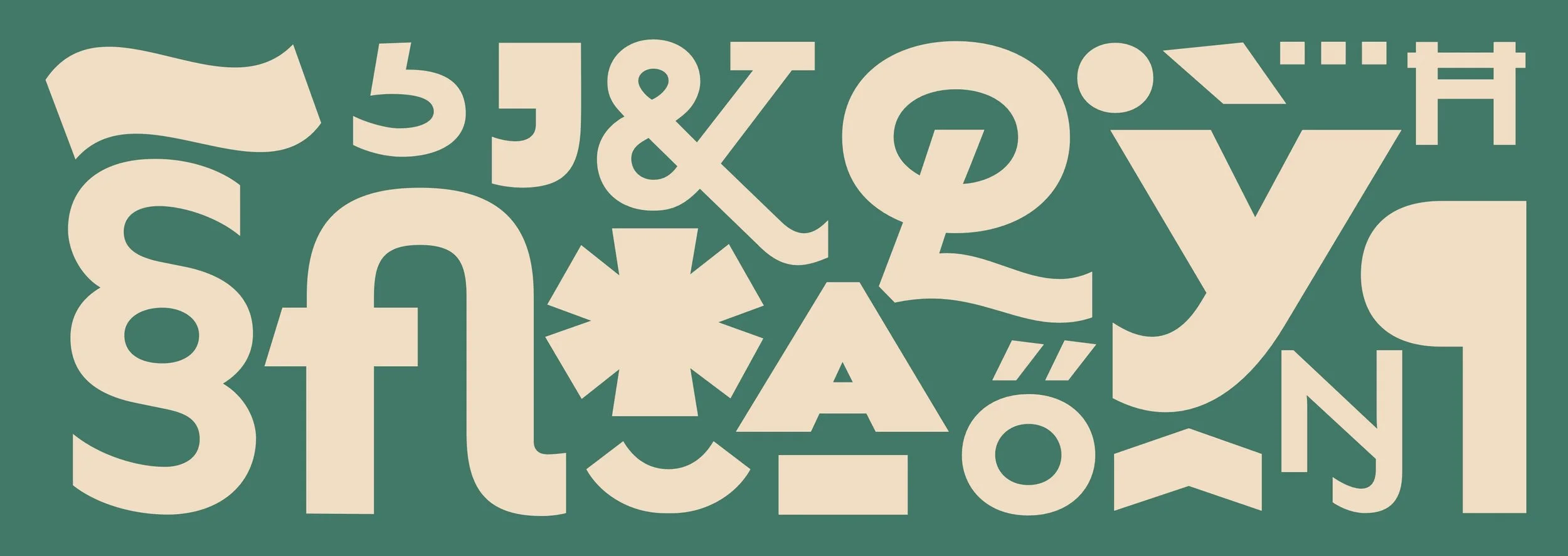
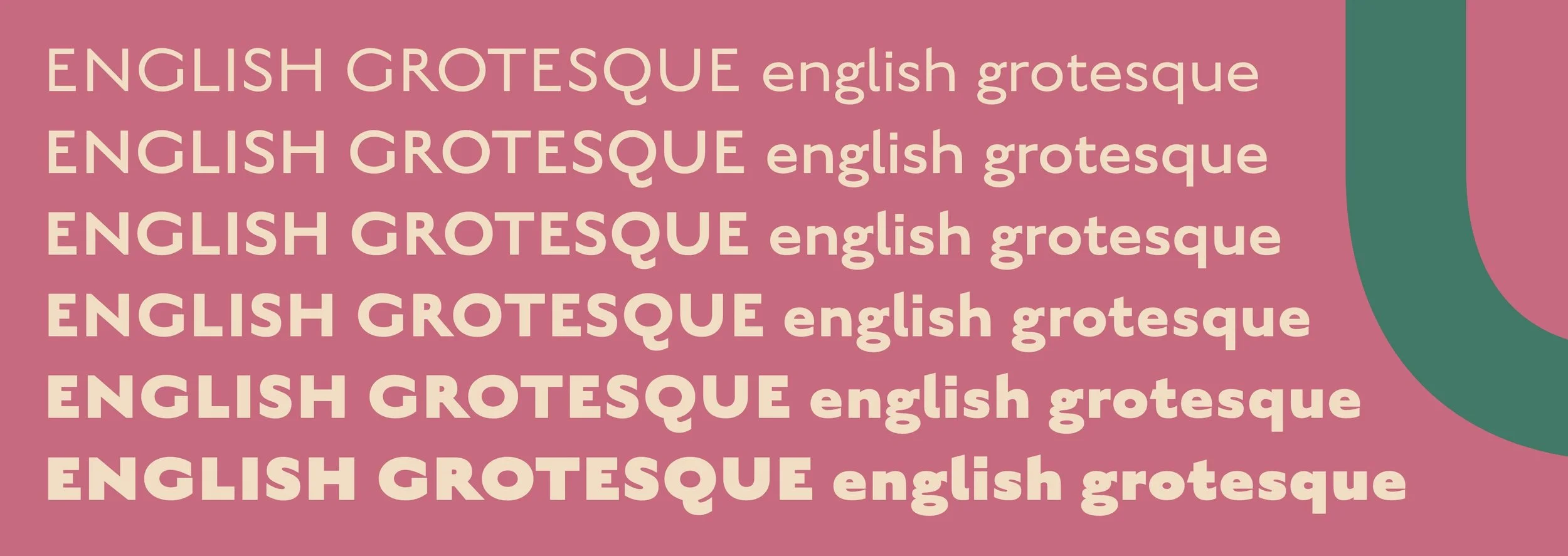
typography
Type sampler for the typeface:
‘English Grotesque.’
Displaying the font’s versatility and range, and highlighting key features, using only the font itself, and complimenting colours.
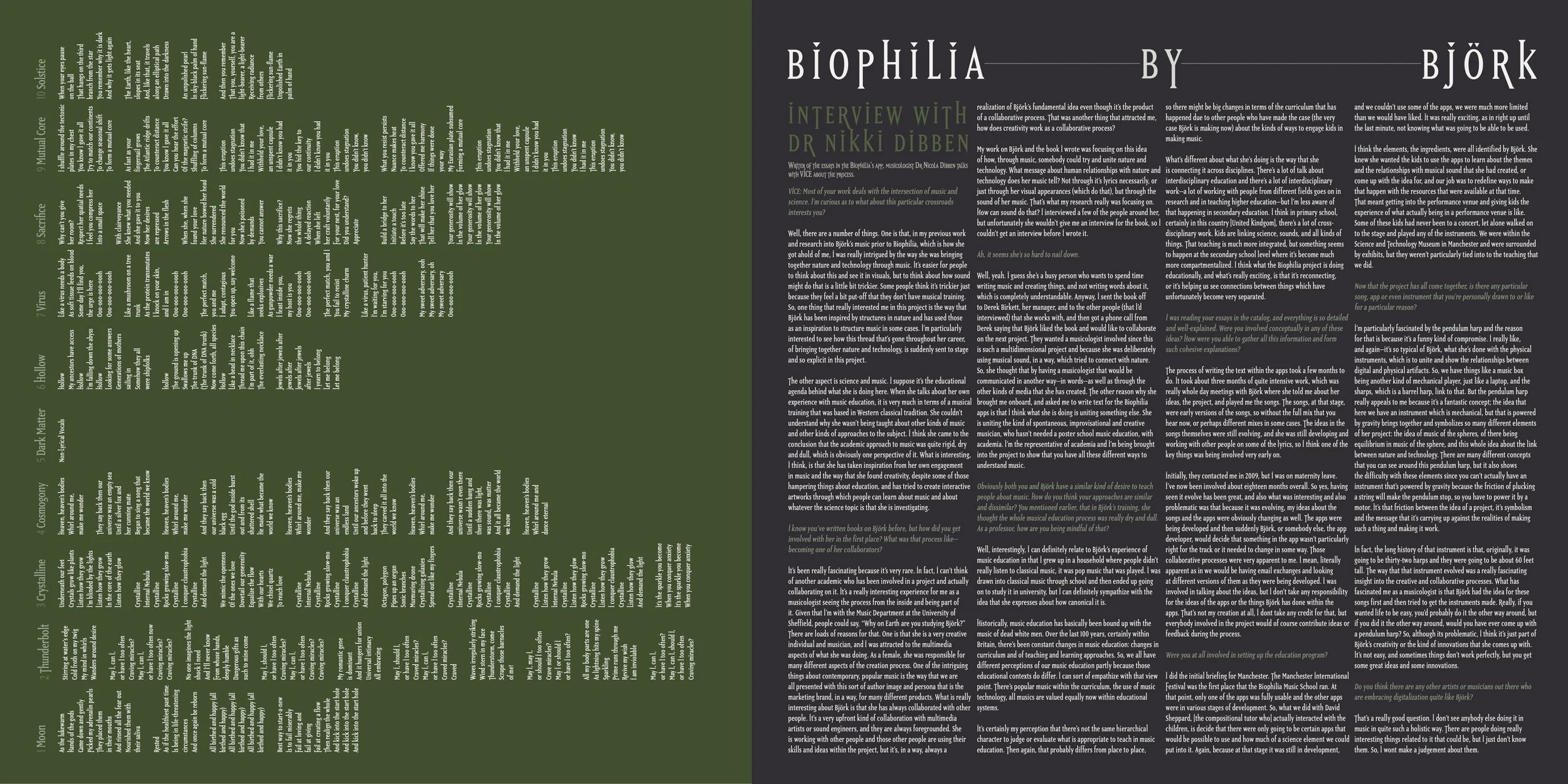
Conceptual vinyl slip design for Björk’s ‘Biophilia’ album.
This project showcases the use of typesetting by including over 2500 words in a limited space, only being able to use one typeface and two colours.
PACKAGING DESIGN

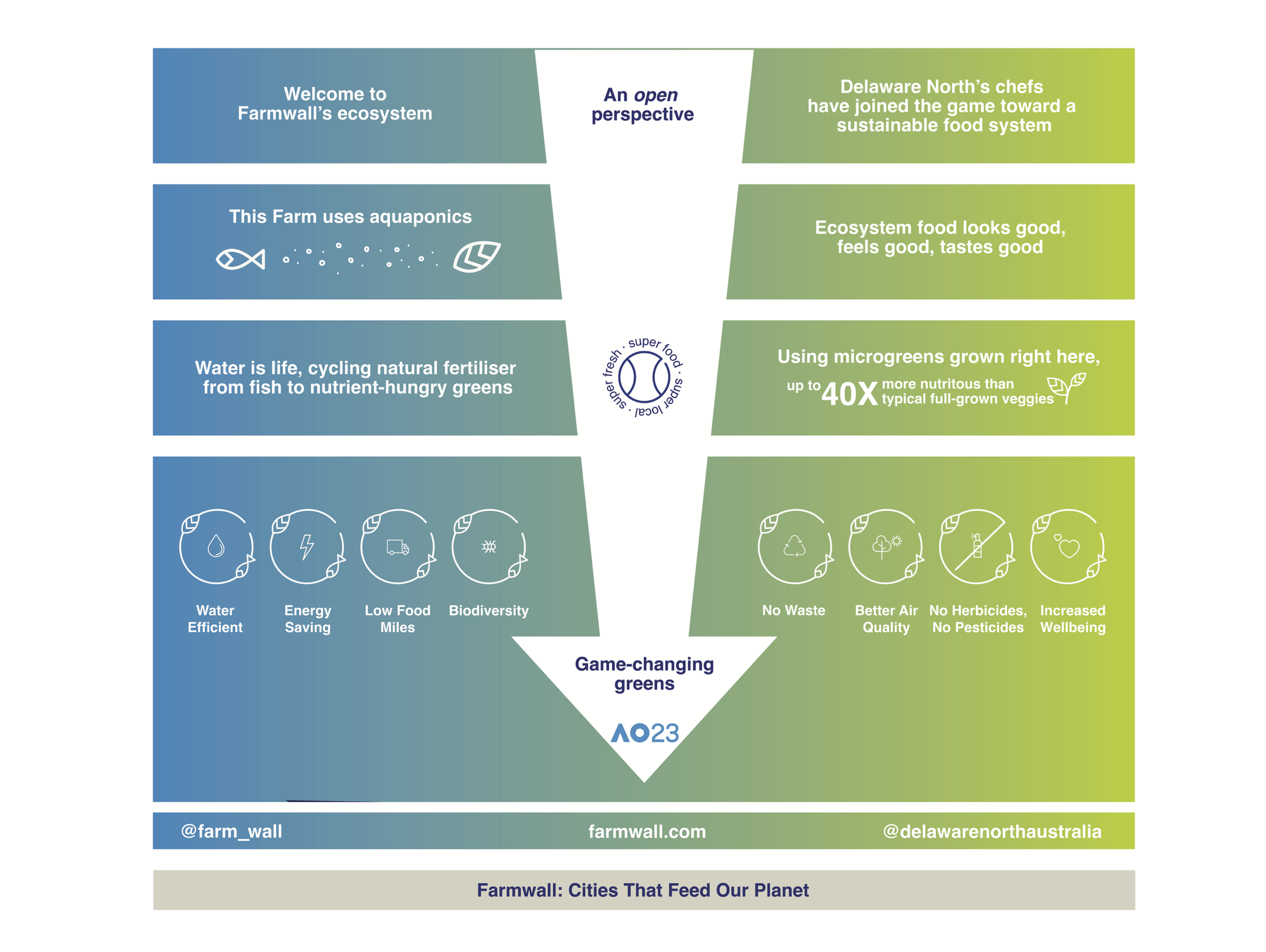
Freelance work for start-up Farmwall, whom create aquaponic fuelled “farm” walls. Farmwall partnered with Delaware North (a catering company) for the 2023 Australian Open. Following the strict brand guidelines of the AO and needs of the client, I designed educational and informative packaging for two “farmwalls.”
Below is: conceptual packaging design following a theme of retro for a bike accessory company. I chose the form of a cylinder box to hold the similarly shaped magnetic bike lights and used bright, funky colours to adhere to 70s disco lights.
-
![]()
BIKE LIGHT
-
![]()
PACKAGING
-
![]()
MOCKUP
-
![]()
RETRO STYLE
-
![]()
BEAM ME


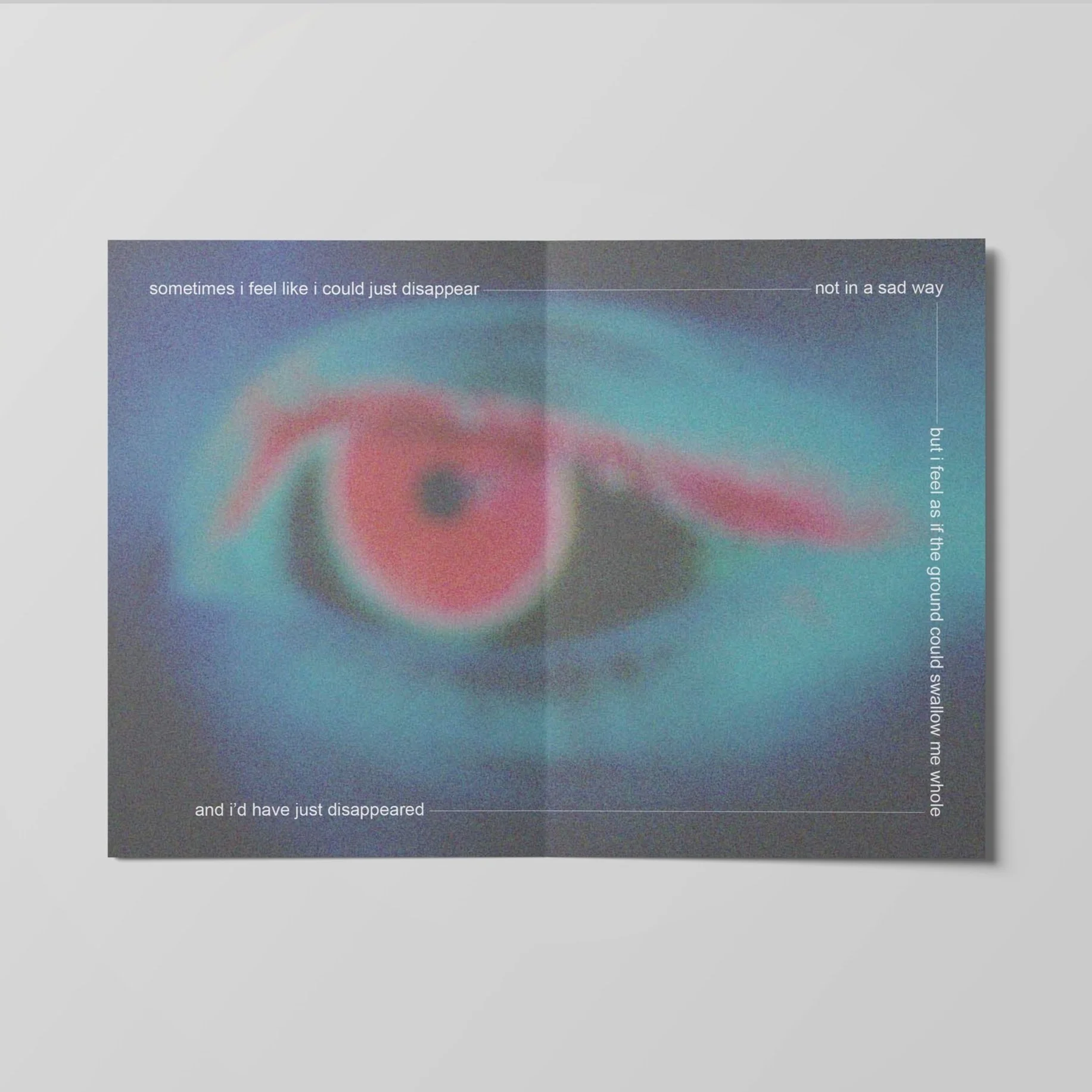
publication design
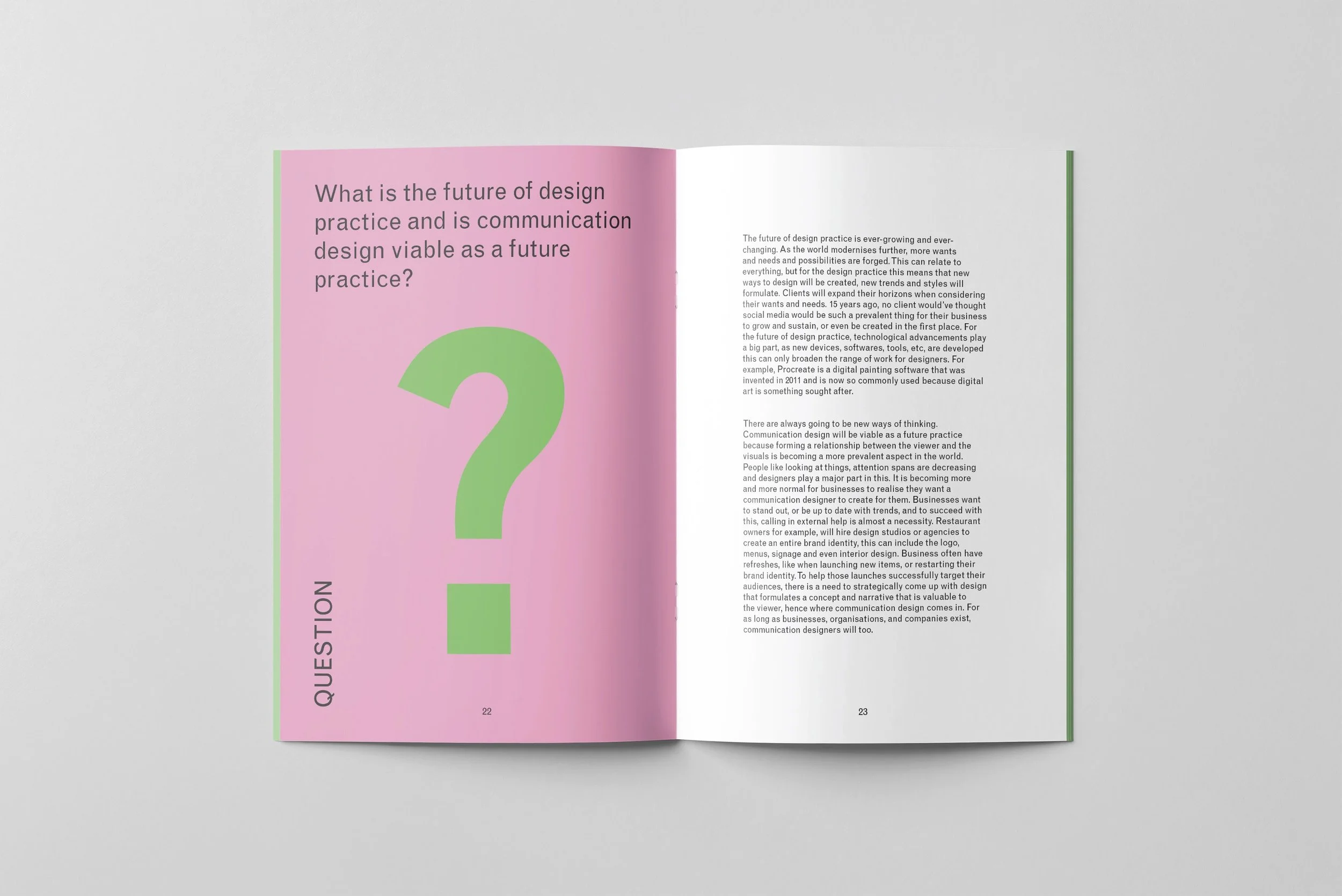
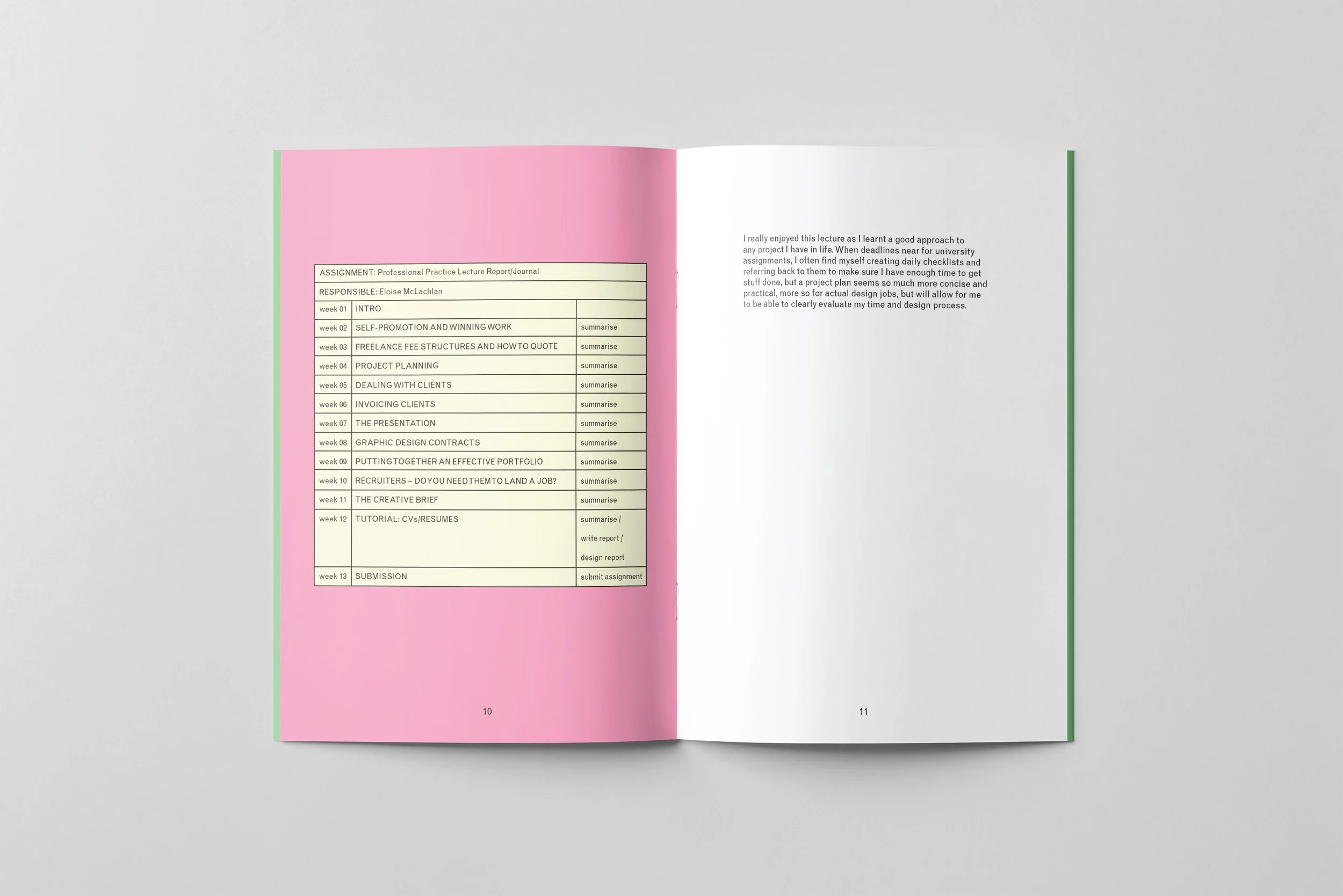
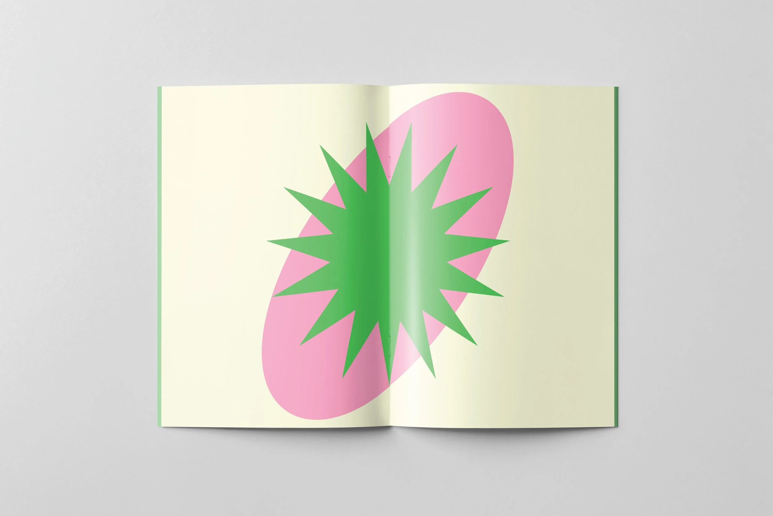
A semester’s worth of lessons.
I put together an A5 report, playing around with typesetting and shapes with the minimal space.


A report comparing two different creative brands:
I found images to accompany the text, and used colour to represent and distinguish the different brands.

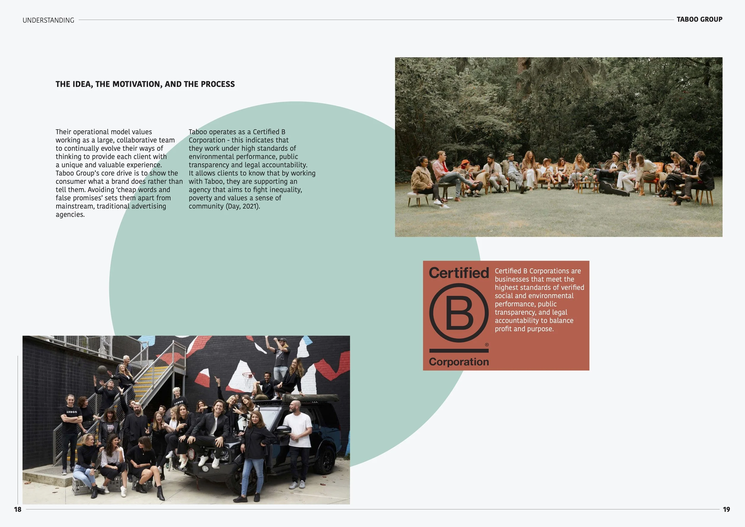
IMAGE MAKING
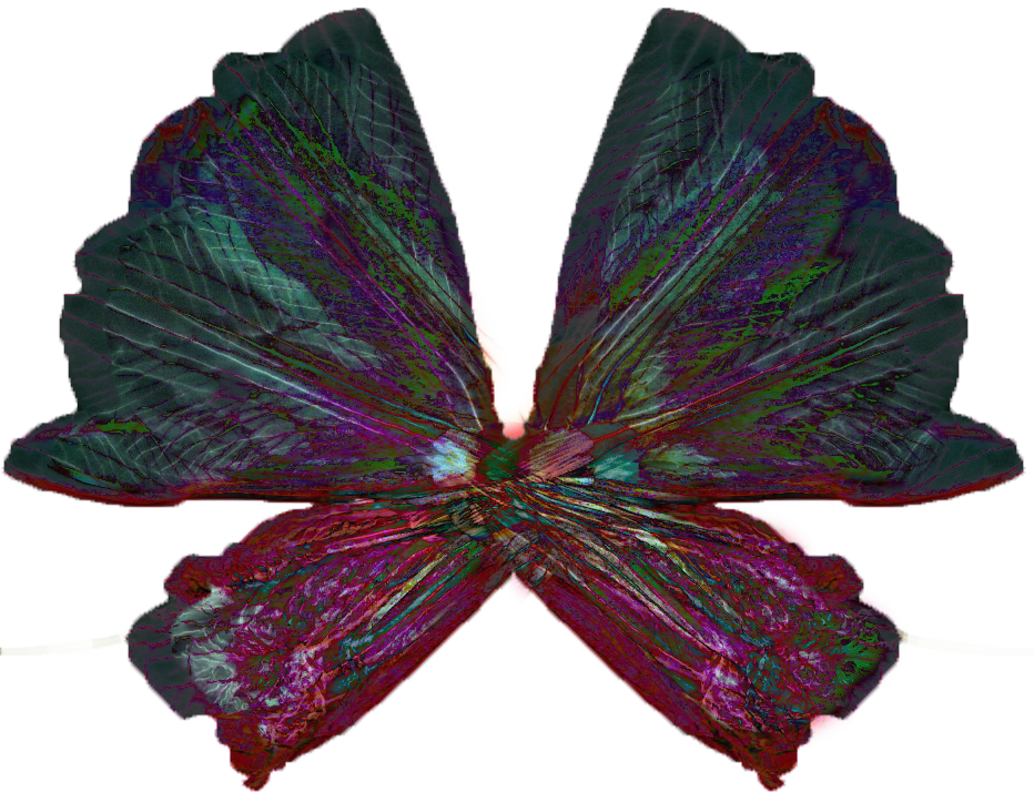

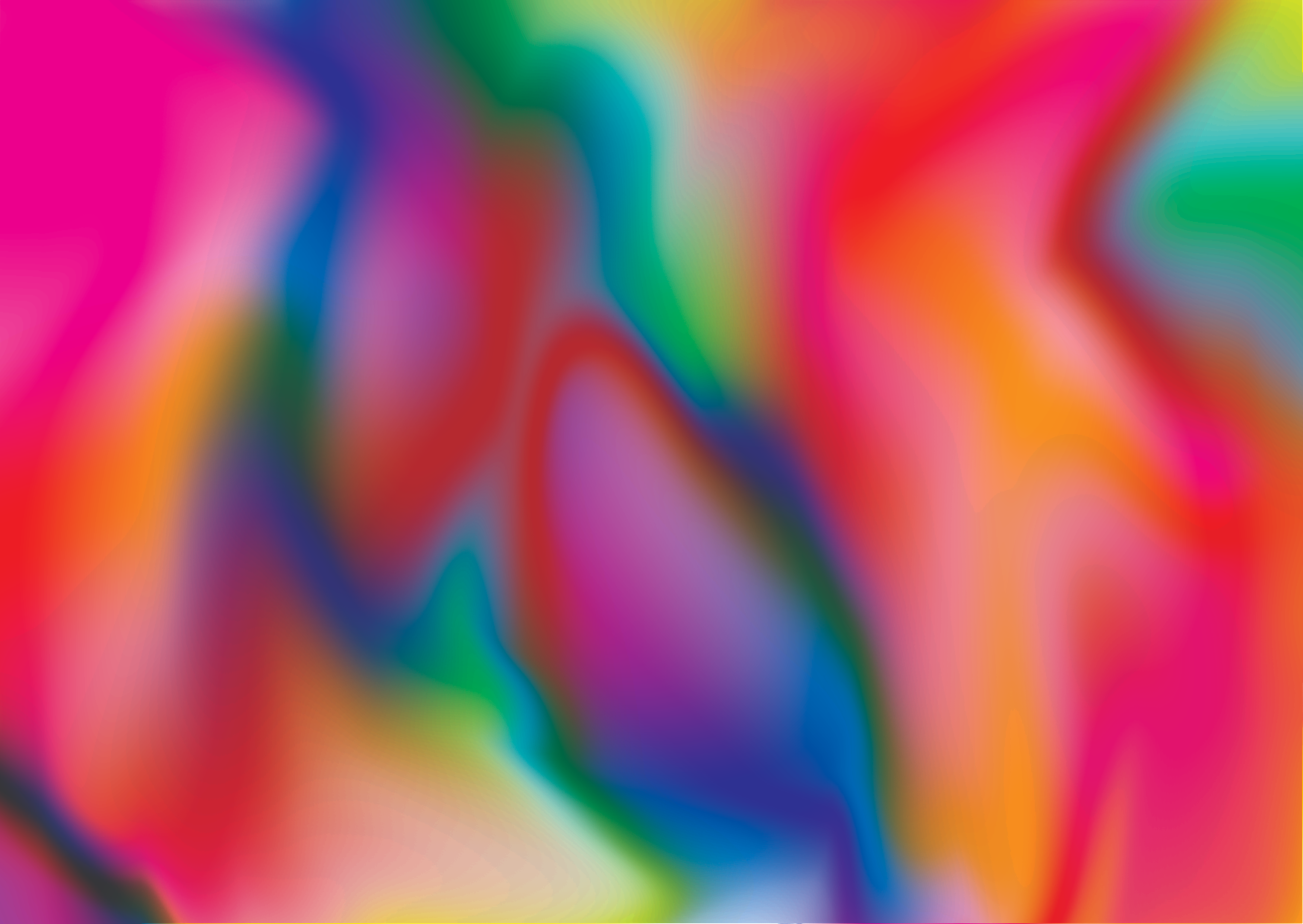
I LOVE COLOUR AND MOVEMENT
ꕤ
I LOVE COLOUR AND MOVEMENT ꕤ

